
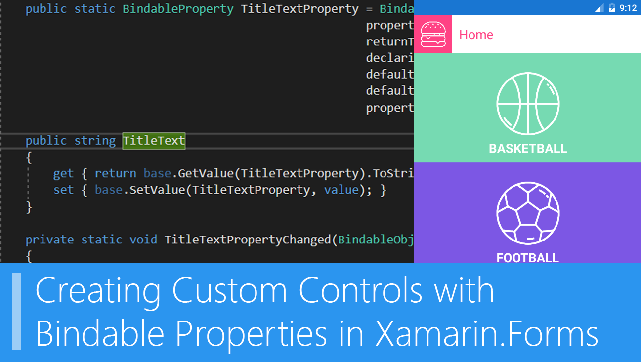
Creating Custom Controls with Bindable Properties in Xamarin.Forms
Last week, I gave a talk for last month’s MSDN Session wherein I talked about Xamarin Live Player. A lot of developers were amazed, especially those who are in need of iOS debugging. Atleast, they can now check their application out in an iOS device without a Mac. Right after my talk and all the questions about Xamarin Live Player, someone came up to me and asked me about how can they create a property for their custom control, because currently, they’re struggling with how to do it. I really found it interesting and told them that I’ll just create a short article about it. So, yeah, that’s the reason why this article exists now lol.
My Custom Control
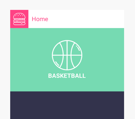
I already created a custom control called MyCustomControl that has a label and an image. I want to use this as a layout for each sport categories that will be shown on my home page. I’ll admit, this isn’t the best example to use for demoing BindableProperty, but this works :P
MyCustomControl.xaml
<?xml version="1.0" encoding="UTF-8"?>
<ContentView xmlns="http://xamarin.com/schemas/2014/forms"
             xmlns:x="http://schemas.microsoft.com/winfx/2009/xaml"
             x:Class="BindablePropertyDemo.Custom.MyCustomControl">
    <Grid x:Name="grid"
          Padding="10,40,10,10"
          HeightRequest="160"
          VerticalOptions="Start">
        <Grid.RowDefinitions>
            <RowDefinition Height="100"/>
            <RowDefinition Height="Auto"/>
        </Grid.RowDefinitions>
        <Image x:Name="image"
               Source="basketball.png"
               HeightRequest="100"
               HorizontalOptions="Center"/>

        <Label x:Name="title"
               Text="BASKETBALL"
               Grid.Row="1"
               FontSize="20"
               VerticalOptions="Center"
               TextColor="White"
               HorizontalOptions="Center"
               FontAttributes="Bold"/>
    </Grid>
</ContentView>
Which results to this:
Anyway, that is what I currently have. I can only set the actual image’s source and label’s text. What I want to do is to create a property that will be exposed by the control. I wonder what do we need to use to do this??? Well, you guessed it, it’s called BindableProperty.
What is a Bindable Property?
Basically, a bindable property is a special type of property, where the property’s value is tracked by the Xamarin.Forms property system. You can read more about Bindable Property in this article.
Setting up Bindable Properties
There are several things that we need to set up on our control’s code behind and we’ll be adding these for each setting this up for each properties that we want to add.
Adding the exposed property
First, you need to create a regular property for your bindable property. We’re gonna start with the label and we’ll name it TitleText. This is the property that will be exposed by the control.
public string TitleText { get; set; }
Adding the BindableProperty field
The next step is to create the BindableProperty. What you need to do is to create a read-only BindableProperty field. Ideally, the name of this field is the same as the regular property that we created, we’ll just add Property at the end of it.
public static readonly BindableProperty TitleTextProperty;
But, ofcourse, we’re not done with it. The next part is to set the the field with BindableProperty.Create() method. This Create() method takes numerous parameters wherein some of them can be null:
       public static readonly BindableProperty TitleTextProperty = BindableProperty.Create(
                                                         propertyName: "TitleText",
                                                         returnType: typeof(string),
                                                         declaringType: typeof(MyCustomControl),
                                                         defaultValue: "",
                                                         defaultBindingMode: BindingMode.TwoWay,
                                                         propertyChanged: TitleTextPropertyChanged);
As you can see,there are several parameters being set. I’m going to break down each of the parameters that I’ve set:
propertyName - the name of our exposed property as a string.
returnType - the return type of our property.
declaringType - the type declaring this BindableProperty.
defaultBindingMode - the binding mode our property should have.
propertyChanged - the specified callback method to be fired after the property has changed. This will receive 3 parameters: bindable (the current control class), oldValue (the old value of the property), and newValue (the newest value of the property)
Adding the callback method
Lastly, we need to create a callback. You can either do this through inline or by creating a callback method. We’ll do it by creating a method:
   private static void TitleTextPropertyChanged(BindableObject bindable, object oldValue, object newValue)
        {
            var control = (MyCustomControl)bindable;
            control.title.Text = newValue.ToString();
        }
Basically, what we just did here is we’re casting the bindable as a MyCustomControl class and setting up the value of the title’s text to newValue’s value.
Again, you need to set this up again if you want to create another bindable property. I actually created another one for the image. This is MyCustomControl’s content now.
public string TitleText { get; set; }

        private static BindableProperty titleTextProperty = BindableProperty.Create(
                                                         propertyName: "TitleText",
                                                         returnType: typeof(string),
                                                         declaringType: typeof(MyCustomControl),
                                                         defaultValue: "",
                                                         defaultBindingMode: BindingMode.TwoWay,
                                                         propertyChanged: titleTextPropertyChanged);


        private static void titleTextPropertyChanged(BindableObject bindable, object oldValue, object newValue)
        {
            var control = (MyCustomControl)bindable;
            control.title.Text = newValue.ToString();
        }

        public static BindableProperty ImageProperty = BindableProperty.Create(
                                                        propertyName: "Image",
                                                        returnType: typeof(string),
                                                        declaringType: typeof(MyCustomControl),
                                                        defaultValue: "",
                                                        defaultBindingMode: BindingMode.TwoWay,
                                                        propertyChanged: ImageSourcePropertyChanged);

        public string Image
        {
            get { return base.GetValue(ImageProperty).ToString(); }
            set { base.SetValue(ImageProperty, value); }
        }

        private static void ImageSourcePropertyChanged(BindableObject bindable, object oldValue, object newValue)
        {
            var control = (MyCustomControl)bindable;
            control.image.Source = ImageSource.FromFile(newValue.ToString());
        }

          public MyCustomControl()
        {
            InitializeComponent();
        }
Consuming the BindableProperty
Now that we’ve set up the bindable properties, what we want to do now is to actually use them. If we go to our MainPage.xaml, we can now use our custom control:
     <custom:MyCustomControl BackgroundColor="#76dab2"
                             TitleText="BASKETBALL"
                             Image="basketball.png"/>
We’re now able to set TitleText and Image which sets up the image’s source and our label’s text! I’ve added a few more and this is how my MainPage.xaml looks like:
MainPage.xaml
<?xml version="1.0" encoding="utf-8" ?>
<ContentPage xmlns="http://xamarin.com/schemas/2014/forms"
             xmlns:x="http://schemas.microsoft.com/winfx/2009/xaml"
             xmlns:local="clr-namespace:BindablePropertyDemo"
             xmlns:custom="clr-namespace:BindablePropertyDemo.Custom"
             x:Class="BindablePropertyDemo.MainPage"
             BackgroundColor="#33334c">
    <ScrollView>
        <Grid RowSpacing="0">
            <Grid.RowDefinitions>
                <RowDefinition Height="60"/>
                <RowDefinition Height="Auto"/>
            </Grid.RowDefinitions>
            <Grid BackgroundColor="White">
                <Grid.ColumnDefinitions>
                    <ColumnDefinition Width="60"/>
                    <ColumnDefinition Width="*"/>
                </Grid.ColumnDefinitions>
                <Grid BackgroundColor="#ff4284" Padding="10">
                    <Image Source="hamburger.png"/>
                </Grid>
                <Label Grid.Column="1"
                   Text="Home"
                   TextColor="#ff4284"
                   FontSize="20"
                   Margin="5,0,0,0"
                   HorizontalOptions="Start"
                   VerticalOptions="Center"/>
            </Grid>
            <StackLayout Spacing="0" Grid.Row="1">
                <custom:MyCustomControl BackgroundColor="#76dab2"
                                    TitleText="BASKETBALL"
                                    Image="basketball.png"/>

                <custom:MyCustomControl BackgroundColor="#7c57e4"
                                    TitleText="FOOTBALL"
                                    Image="football.png"/>

                <custom:MyCustomControl BackgroundColor="#f1b136"
                                    TitleText="GRIDIRON"
                                    Image="gridiron.png"/>
            </StackLayout>
        </Grid>
    </ScrollView>
</ContentPage>
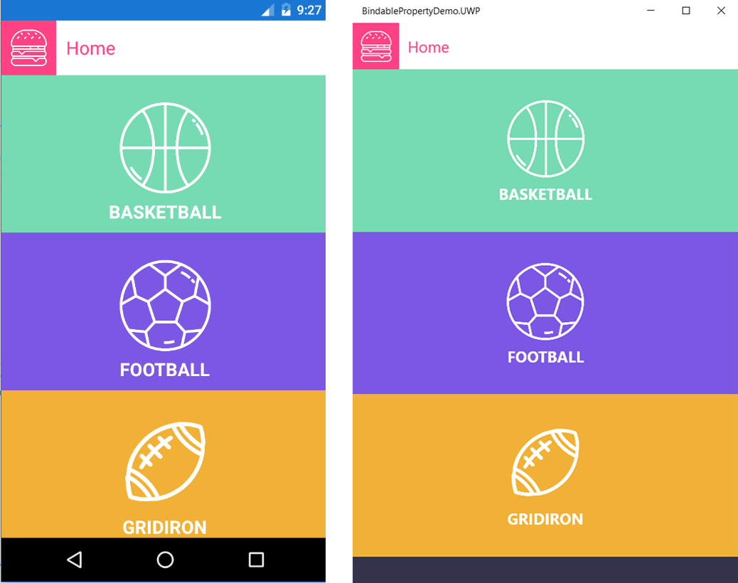
We’re all done! Now, running this application will result to this:
If you want to try this out, I uploaded this project to github. Hopefully, this can get you started with creating bindable properties. Happy coding!
Reference: